woensdag, december 21, 2011

Variance not created as a footer in DeskI

This is a minor bug that exists in BusinessObjects XI and Business Objects 6.

When you add a variance to a table, the variance column isn’t marked as a footer.

image

I add the variance :

image

So far, so good.

image

But when I add the sales revenue in a column behind it, it doesn’t aggregate. It just shows the last one.

Solution :

image

In the table-properties, manually activate the table footer.

Peter De Rop

woensdag, december 14, 2011

Creating a KPI in PerformancePoint

So far, it’s been a love/hate relationship with SharePoint, but a tool like PerformancePoint does get my full attention. So far, I had some trouble getting it to do what I want, so, here I share what I found so far.
1) Deploying a demo-cube
Once I had downloaded the AdventureWorks2008 database, I found a great procedure right here:
http://techpunch.wordpress.com/2008/09/08/sql-server-2008-how-to-build-and-deploy-adventureworks-olap-cubes/
2) Creating the connection:
image
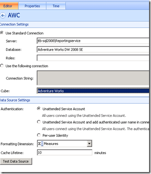
I provided the server and instance name. Note the backslash to enter the instance name. Not a forwardslash, which was one of the errors I made.
Secondly, I selected the Database and Cube.
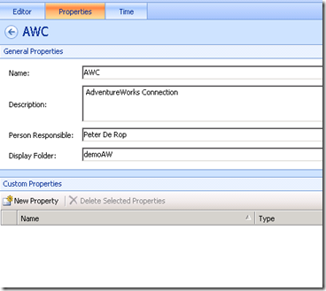
Next, on the properties tab, I provided a name:
image
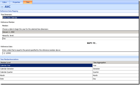
And last but not least, the Time-tab. So far, it eluded me somewhat.
To get this to work, you need a time-hierarchy in your OLAP cube. Fortunately, the AdventureWorks database has one, in case you want to try it out.
image
For the Time Dimension, I chose to use Date.Date.Calendar, which points to a time-hierarchy in the AdventureWorks OLAP cube. Secondly, I browsed to a child item I wanted to use as a reference. In this case, I took January,1,2002. And I defined the level to be Day, because the above selection is in fact a day.
Underneath, you then have to choose from a calendar, to what date this particular item maps. I guess Performance Point is trying to work out what format the date is in and I’ve seen more intuitive interfaces to accomplish this.
Below that, you now have the chance to tell Performance Point, which item in your OLAP cube maps to the Year, the Semester, the Quarter the Month, the Day, the hour and the minutes if you have them.
There, that’s the tricky part.
3) Creating the KPI
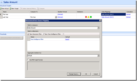
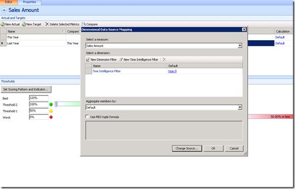
First, you choose, which measure in your database contains the number you want to show. In my case, that’s going to be the Sales Amount measure. (note the button at the bottom: “Change Source”) Took me a while to locate that one Glimlach
image
For the filter, I created a Time Inteligence filter. And I entered Year-8 This will return data for the current year,-8 years. My first mistake was to enter Year-1 because I thought the date I had chosen at the datasource, would be used as a reference, not true. It takes the current date.
So, Year-8 it is.
I then did the same for the target. By the way, I renamed them to be This year and last year.
image
And I entered Year-9 for that one. This way, I could compare 2003 to 2002 figures.
After clicking OK, I then proceeded to make a scorecard:
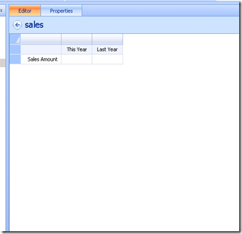
I just dragged the KPI (from the right pane) into the Scorecard and disco :
image
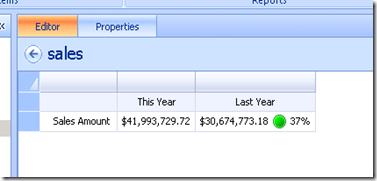
No numbers, but lo and behold, when you press save or ctrl-s, they do emerge:
image
Our KPI tells us we did 37% better than last year. Cool.
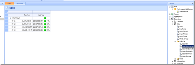
Last step, we could add the quarter by dragging it again from the right pane:
image
Nice
More to come

Binabik
@DPValues and @DPEnd

A nice little piece of nothing this one.
I noticed on the forums, someone asking about these functions. So, I did some digging.
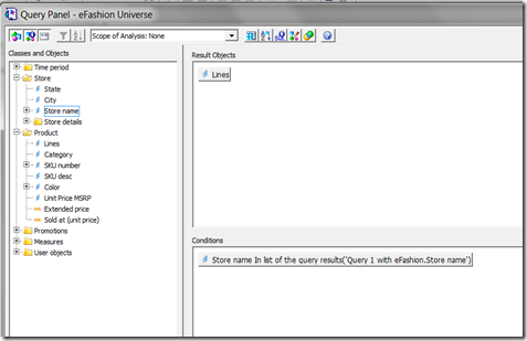
I built a first query that list stores :
The query became something like :
SELECT
 
Agg_yr_qt_mt_mn_wk_rg_cy_sn_sr_qt_ma.Store_name
FROM
  Agg_yr_qt_mt_mn_wk_rg_cy_sn_sr_qt_ma
Then, I based a query on it:
image
the query became :
SELECT
 
Article_lookup.Family_name
FROM
  Article_lookup,
  Outlet_Lookup,
  Shop_facts
WHERE
  ( Outlet_Lookup.Shop_id=Shop_facts.Shop_id  )
  AND  ( Article_lookup.Article_id=Shop_facts.Article_id  )
  AND  (
      @dpvalues('
Outlet_Lookup.Shop_name',9,1)@dpend
  )
at the next iteration, it became:
@dpvalues('
Outlet_Lookup.Shop_name',9,7)@dpend
and when I tried filtering for a number, it became:
@dpvalues('
sum(Agg_yr_qt_rn_st_ln_ca_sr.Sales_revenue)',536870916,12)@dpend

This tells me, it’s not a user-function. It’s an internal function. The user is expected to use a subquery instead.
Or, as Andreas stated on the forums :  query on query, which allows you to filter based on a different datasource.

Binabik


vrijdag, december 09, 2011

Table titles, a well hidden feature

Imagine that, a feature that is so well hidden, that I only found it after teaching Business Objects for four years. In fact, it has been in Business Objects ever since version 5 as far as I know.

Here’s the deal :

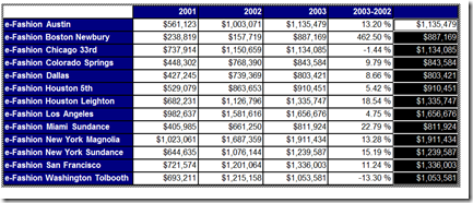
image

We want to show two values in a cross-tab. In this case, I took Sales revenue and Margin.

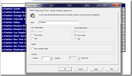
The way it shows, you can’t really make out what each number is. But there is a solution. Both in WEBI and DESKI, you can set an option. So, right-click the table and choose “Format Crosstab” if you’re in DESKI.

image

Now, you check: “Show Variable Header”.

image

There, the title is showing. (In a minute, I’ll show you how to center the year above those columns) But first, how do you do this in WEBI ?

image

In WEBI, on the Properties tab, you check “Show Object Name”.

So, how do we center the title ? Easy.First, we add a break to the year.

image

Next, we delete the extra columns, but because of a BUG, you can’t delete these columns if you try it in Rich Client. In stead, go to the properties and deactivate the footer on the break.

image

In DeskI, just delete the columns of course.

The last step is to Center values across the break as shown above. In DeskI, this is a property of the break, which you can set in Slice and Dice.

The result :

image

There, a clean table

Cheers

Peter De Rop

dinsdag, december 06, 2011

A Pareto Chart

While I was writing the article about “Control charts”, I found out about “The Seven Basic Tools of Quality”. It was the first time I learned about that – and I realised that at least 4 of those seven tools can be built in Business Objects DeskI and WebI.

Those four tools are :

  • A Control chart (described in a previous article)
  • A Pareto chart
  • A Histogram
  • A Scatter Diagram

In this particular article, I wish to show you a Pareto Chart.

Basically, it is a chart that shows a bar and a line, where the line illustrates the importance of each of the bars.

This is accomplished by sorting the values from high to low and presenting them on a bar-chart. And then, adding the RunningSum/Total on a linechart.

image

The above chart shows that 50% of our reservations are made in 3 months April, August and February.

I realise that this isn’t the typical sort of data on which you use this particular chart, but I do believe this can be a useful way of presenting pretty much any kind of number. Where you want to compare your number to a % in total.

The example used on WikiPedia is various sources of absenteism. In an other source, I found the possible deseases among cattle, in order to find the deseases you want to tackle first.

So, enough talk. Without any further ado: The Pareto Chart.

Step 1. List your data in a table and sort it Large to Small :

image

Step 2 :

Calculate the Runningsum and divide by the total:

image

=RunningSum([Future guests])/Sum([Future guests]) in Report * 100

I multiply times 100 to make it a bit cleaner on the z-axis of the chart.

image

As soon as you do this however, any sorting on the table is gone, so we’ll have to re-sort.

Step 3: Click View structure, sort the measure you want to have sorted:

image

Second problem, the scale is wrong. It should be from 0 to 100. On the properties tab, make sure you set it to be 0 to 100. Given the type of number we have here, it will never be anything else than 0 to 100.

image


And we have ourselves a PARETO-chart.

Peter De Rop