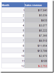
This is a classic.When you’ve been creating charts in Business Objects, you know about this one. Let’s start by looking at the data we would want to present in a chart:
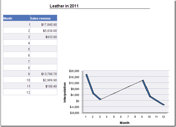
As you notice, there are a few months missing. They’re simply not there because we didn’t sell that particular product in that particular month at all. Still, we wish to present the data in a line-chart and display a line across those missing months, without leaving a gap.
For you WEBI users, we have a solution.
The only solution is adding a second query to your report, where you have all 12 months.
In your query editor, click : Add Query and select only the month dimension.
Once you did that and you added the month to the chart (instead of the month from the first query)
your Chart will look like :
Not much of an improvement.
This is what it looks like in WEBI
and with the extra query added :
For now, in DeskI, this is how far you could get. The only Solution that remains for DeskI is to calculate the rest of the chart by hand (which is what i will show in a next blogpost. In WEBI however, we have a much better solution : the function “interpolation”.
=Interpolation([Sales revenue])
Obviously, the numbers we get this way are fictious. They just serve to close the gap on the chart. It’s clearly the purpose to use the previous display of the data, but we use these numbers for our chart – this results in :
And we have a much cleaner chart.
Hope you find this useful.
Oh, and Mind the Gap
Cheers,
Binabik


Geen opmerkingen:
Een reactie posten