This is an underused feature, as far as I’m concerned. Every time when I mention these things, people’s eyes go all glazy, but it is a pretty cool feature of charts.
First off, what are logarithms, for those of you who don’t already know.
The logarithm (and I mean those that are based on the number 10) are the power to which number 10 needs to be raised to reach a certain number.
So, Log(10) = 1 because 10^1 = 10 and Log(100) = 2 because 10² = 100. In fact, until the 1970’s, logarithms were used to multiply and divide. Because if you subtract two logarithms, you divide and when you add two logarithms, you do, in fact, a multiplication.
So, it can be a way to write down large numbers.
When used in charts, they can be very useful when you’re looking at numbers that are very far apart.
Take for example this table:

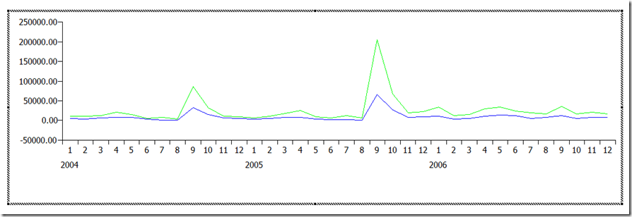
It contains Sales revenue and Margin for a period of three years, with numbers varying from -173 to 205000. If we would put this on a decimal chart, the result would be this :

The good months stand out quite clearly. We did extremely well in September. But as a result, the bad results are masked. They just don’t show up, because near the 0-level, the scale is too large. A Logarithmic scale solves this :

September still stands out, but now, it is in proportion. August, which is extremely low, also shows up a lot clearer.
So, when looking at your numbers, remember to use Logarithmic scales if you want to get a clearer picture of what your data is really trying to tell you.
Binabik
Geen opmerkingen:
Een reactie posten