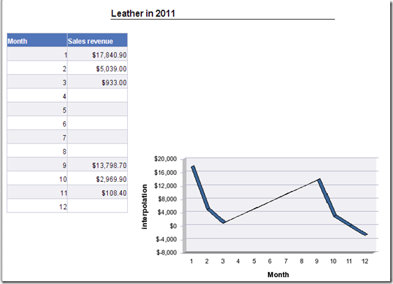
This is what we would want.A trendline in Business Objects.

It is not possible to let Business Objects insert a trendline in a chart automatically. It’s a feature that is simply missing. This is what I have been living with until now, it simply isn’t possible, end of story. And that makes me rebel. I want to make it possible.
Two problems : I’m not a real good mathematician. The math to achieve trendlines isn’t easy math either.
But, good news, I figured it out – and it works. Over the next few articles, I will hand you the math to add trendlines to your charts.
Our first type of trendline : A LINEAR TRENDLINE
The functions Excel uses to calculate that trendline looks like this :

and this

That’s the sort of math that makes my head spin – but after 5 minutes, I figured out how it works and then it’s easy. In case you don’t know, the x and y with a dash over their heads are averages.
The first function gets you the “direction-coëfficiënt”, the second gives you the interception point. Both are needed to calculate the trend.
Step1:
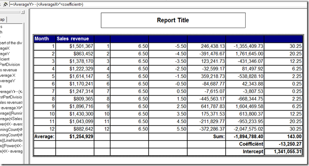
Calculate the average on both X and Y.

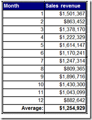
In this case, I used the formula : Average(<Sales revenue) in Report. If you don’t know what the “in Report” stands for, you should have a look at the articles about contexts. It’s not an easy subject.
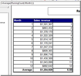
With that, we have the average of Y and we also need the average of X. This might be a bit strange. Basically, you just need to find the middle of the X-axis of your chart.
So, we need to count how many items there are and find the middle of that. In fact, for our 12 months the middle is not 6 but 6,5 because it’s an even number of lines. So, what I end up doing is using a runningcount function :”=RunningCount(<Month)” Which I then take an average on.

the function at the end is : =Average((RunningCount(<Month>) )) In Report. which I define as variable <AverageX>
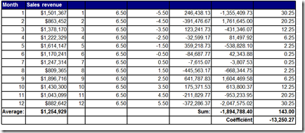
This means, that at this point, we have the two numbers with the dashes over their heads. Next, we need to subtract the X and Y values from it.
For X, this is : =((RunningCount(<Month>) In <Month>) - <AverageX>) In <Month> which I define as a variable X – AverageX

Next, we need Y – AverageY
=(<Sales revenue> - <AverageY>) In <Month> which I define as Y – AverageY

Next, we need to multiply those : =<X - average X>*<Y - AverageY> and add them up.

This gives us the first part of our division, specified at the beginning of this document.
For our second part, we need to Square x-divisionX and add them up.
that’s :=Sum(Power(<X - average X> , 2) In Body) In Report

Last but not least, we need to divide them to get the direction Coëfficient.

Now that we calculated b, we can proceed to calculate

This translates to :
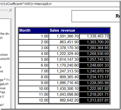
=<AverageY> - (<AverageX>*<coefficient>)
and that’s our “Intercept” which amounts to the Intercept function in Excel.

Now we can calculate the values for our Trendline. The function in this case (for a linear Trendline is:
y = mx + b
m = direction coëfficient
b = intercept

the x-Value is our runningCount on the month (remember )
)
So, now we transform this to a chart :

I had a great time trying to figure this one out, so I hope it’s useful to anyone. Next up Logarithmic trendlines. It won’t be easy, I can promise you that 
ah.. last but not least, this is what that trendline looks like in Excel 

Isn’t that – entirely – identical  Lovely.
Cheers
Binabik


