vrijdag, november 18, 2011

Stopping gaps in Business Objects Charts

This is a classic.When you’ve been creating charts in Business Objects, you know about this one. Let’s start by looking at the data we would want to present in a chart:

image

image

As you notice, there are a few months missing. They’re simply not there because we didn’t sell that particular product in that particular month at all. Still, we wish to present the data in a line-chart and display a line across those missing months, without leaving a gap.

For you WEBI users, we have a solution.

The only solution is adding a second query to your report, where you have all 12 months.

In your query editor, click : Add Query and select only the month dimension.

Once you did that and you added the month to the chart (instead of the month from the first query)

your Chart will look like :

image

Not much of an improvement.

This is what it looks like in WEBI

image

and with the extra query added :

image


For now, in DeskI, this is how far you could get. The only Solution that remains for DeskI is to calculate the rest of the chart by hand (which is what i will show in a next blogpost. In WEBI however, we have a much better solution : the function “interpolation”.

=Interpolation([Sales revenue])

image

Obviously, the numbers we get this way are fictious. They just serve to close the gap on the chart. It’s clearly the purpose to use the previous display of the data, but we use these numbers for our chart – this results in :

image

And we have a much cleaner chart.

Hope you find this useful.

Oh, and Mind the Gap Glimlach

Cheers,

Binabik

woensdag, november 16, 2011

An Exponential Trendline in Business Objects

This is going to be the third type of Trendline and I just noticed, Excel has six of them. I’m not sure how many really are used, or if there is a specific need for any in particular. So, for now, I’m gonna keep this at three, unless there is a demand for the other three. (Polynomial, Power and Moving Average).

I am going to add those three eventually, just for fun, but I’m going to keep them for a cold winter evening. Or when the question arises.

So, here’s the Exponential Trendline.

The magic number for the Exponential trendline is e. I’ve been reading about the constant e on Wikipedia and it’s a great story. You should read it too. One of the things I noticed is the amount of history that lies at the base of these trendlines. Amazing.

First, the formula:

Equation

Where c and b are constants. Each time when they say that (and here is where I find that info) I’m a bit pissed off. Especially, because they’re not constants at all. They’re calculated values. All of them.

c, as usual, is the intercept point but this time, it uses the Natural Logarithm of Y and the value (non Logarithm) of X. In fact, the calculation uses the EXP function, which is the inverse of a Natural Logarithm.

So, if i = ln(x), then exp(i) = x.

b is the coëfficient which we calculated in both other trendlines before, but this time, it uses the ln of  y.

(ah, on a sidenote, I wrote 2011 in my report, but on the test-databases that come with Business Objects, the numbers are identical for 2003 or 2006 –amazing huh Glimlach )

So, I take the ln on Sales Revenue and I call it LnY

The formulas are:

image

=ln(<Sales revenue> in body) in report (which is called LnY)

=Average(<LnY> in body) in Report (which I call AverageLnY)

Like in the linear trendline, we calculate X-AverageX where X is a Runningcount of the Month.

=((RunningCount(<Month>) In <Month>) - <AverageX>) In <Month>

=(<LnY> - <AverageLnY>) In <Month> becomes the variable LnY-AverageLnY

and we multiply those two :

=<LnY-AverageLnY>*<X - average X>

After which we add them up. As before, we now have the top of our division:

=Sum((<LnY-AverageLnY> * <X - average X>) In  Body) In Report

For the bottom part of our division, we need the Square of X-AverageX added up.

=Power(<X - average X>, 2) In <Month>

image

Now we divide those numbers

image

There, that’s our b-variable which we can use to calculate our c variable.

=<LnY>-(<LnCoeff>*<xvalue>)

image

There we go, we have both variables to put into our formula.

e = 2.71828, I found that on Wikipedia.

Now, one more thing needs to be done, and it’s probably why this is called the exponential trendline, we need to take the EXP of our intercept point (our c-variable)

=Exp(<InterceptLn>) In Report

image

=<ExpIntercept>*(Power(2.71828 ,(<LnCoeff>*<xvalue>)))

this is the formulat shown at the top, turned Business Objects. We add that one and convert it to a table. That gives us the following chart:

image

And excel does this :

image

Again, a perfect match.

There. That gives you Linear, Logarithmic and Exponential trendlines to add to your charts.

Enjoy

Binabik

zondag, november 13, 2011

Logarithmic Trendline in Business Objects

Right, looks like I overestimated this one. After doing the previous one, Logarithmic just sounded a bit more scary. It really isn’t. In fact, it was the Microsoft site that got me a bit going. They mentioned something called “Linear Regression”. I looked up the math and it looked impressive. I had no idea, that was what I had already done in the previous article.

That has been my experience so far. A series of terms is unknown to me. This makes it fun to figure out how this stuff works because I really have to figure it out for myself.

Like the function in excel to calculate the Intercept point. On one site, I found this construction :

=index(linest(A1:A20;B1;B20);1)

Then, I found that the intercept function does exactly that. =intercept(A1:A20;B1:B20)

Ah well. it’s an amazing journey – and I’m enjoying every stop along the way.But without further ado, here’s the Logarithmic Trendline.

First off, the math is exactly the same as we had in the Linear trendline except that we don’t use x but ln(x). which is the natural logarithm of x.

for this, I use the function =Ln(runningcount(<Month>)) in <Month>

image

As with last time, I try to avoid using the month in a calculation, although it would work just the same.

Next up, we calculate the average of that column. In fact, that’s the only difference with the linear trendline.

image

=Average(LnX in Body) in Report is the function I use for that one.

image

Like with the linear trendline, we then need to make the difference between X and average X (this time with the logarithms of course) and Y- averageY.

=LnX – AverageLnX in Month

=Y – AverageY in Month

Next, we multiply those two with eachother and add them up.

image

=LnX-AverageLnX * Y-AverageY

=Sum(LnX-AverageLnX*Y-AverageY in body) in report

That last one is going to be the first part of our division.

image

Like last time, we now need to Square X-AverageX, but this time, it has to be the Ln version. So, the formula would be:

=sum(ln(x)-AverageLnX * ln(x)-AverageLnX  in body)in report

That’s going to be the second part of our division.

Next, we divide those two.

image

And we have our Direction Coëfficient.

Next up, we need the interception.

image

For this one, we need to subtract from AverageY

=<AverageY> – (<AverageLnX>*<LnCoëfficiënt>)

This formula, again, is the same as Linear trendline, but we use the one where we calculate the logarithm of X.

the next formula is : (Coefficient*LnX)+ InterceptLn

image

And then, we convert this baby to a chart.

image

And, it has the typical Logarithm curvature Glimlach

Here is the version Excel comes up with – and again, they are identical.

image

There. A logarithmic trendline is perfectly possible in Business Objects. One less reason to convert your Business Objects Report into an Excel sheet.

Next up : Exponential Trendline

Have a nice day !!

Binabik

donderdag, november 10, 2011

Trendlines in Business Objects

This is what we would want.A trendline in Business Objects.

image


It is not possible to let Business Objects insert a trendline in a chart automatically. It’s a feature that is simply missing. This is what I have been living with until now, it simply isn’t possible, end of story. And that makes me rebel. I want to make it possible.

Two problems : I’m not a real good mathematician. The math to achieve trendlines isn’t easy math either.

But, good news, I figured it out – and it works. Over the next few articles, I will hand you the math to add trendlines to your charts.

Our first type of trendline : A LINEAR TRENDLINE

The functions Excel uses to calculate that trendline looks like this :

and this

That’s the sort of math that makes my head spin – but after 5 minutes, I figured out how it works and then it’s easy. In case you don’t know, the x and y with a dash over their heads are averages.

The first function gets you the “direction-coëfficiënt”, the second gives you the interception point. Both are needed to calculate the trend.

Step1:

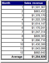
Calculate the average on both X and Y.
image

In this case, I used the formula : Average(<Sales revenue) in Report. If you don’t know what the “in Report” stands for, you should have a look at the articles about contexts. It’s not an easy subject.

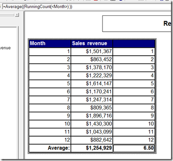
With that, we have the average of Y and we also need the average of X. This might be a bit strange. Basically, you just need to find the middle of the X-axis of your chart.

So, we need to count how many items there are and find the middle of that. In fact, for our 12 months the middle is not 6 but 6,5 because it’s an even number of lines. So, what I end up doing is using a runningcount function :”=RunningCount(<Month)” Which I then take an average on.
image

the function at the end is : =Average((RunningCount(<Month>) )) In Report. which I define as variable <AverageX>

This means, that at this point, we have the two numbers with the dashes over their heads. Next, we need to subtract the X and Y values from it.

For X, this is : =((RunningCount(<Month>) In <Month>) - <AverageX>) In <Month> which I define as a variable X – AverageX

image

Next, we need Y – AverageY

=(<Sales revenue> - <AverageY>) In <Month> which I define as Y – AverageY

image

Next, we need to multiply those : =<X - average X>*<Y - AverageY> and add them up.

image

This gives us the first part of our division, specified at the beginning of this document.

For our second part, we need to Square x-divisionX and add them up.

that’s :=Sum(Power(<X - average X> , 2) In  Body) In Report

image

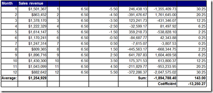
Last but not least, we need to divide them to get the direction Coëfficient.
image

Now that we calculated b, we can proceed to calculate

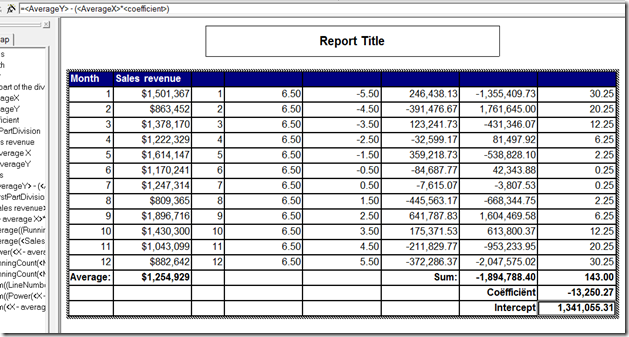
This translates to :

=<AverageY> - (<AverageX>*<coefficient>)

and that’s our “Intercept” which amounts to the Intercept function in Excel.
image

Now we can calculate the values for our Trendline. The function in this case (for a linear Trendline is:

y = mx + b

m = direction coëfficient

b = intercept

image

the x-Value is our runningCount on the month (rememberGlimlach)

So, now we transform this to a chart :

image

I had a great time trying to figure this one out, so I hope it’s useful to anyone. Next up Logarithmic trendlines. It won’t be easy, I can promise you that Glimlach


ah.. last but not least, this is what that trendline looks like in Excel Glimlach

image

Isn’t that – entirely – identical Glimlach Lovely.

Cheers

Binabik

woensdag, november 02, 2011

Logarithmic Scales in Charts


This is an underused feature, as far as I’m concerned. Every time when I mention these things, people’s eyes go all glazy, but it is a pretty cool feature of charts.
First off, what are logarithms, for those of you who don’t already know.
The logarithm (and I mean those that are based on the number 10) are the power to which number 10 needs to be raised to reach a certain number.
So, Log(10) = 1 because 10^1 = 10 and Log(100) = 2 because 10² = 100. In fact, until the 1970’s, logarithms were used to multiply and divide. Because if you subtract two logarithms, you divide and when you add two logarithms, you do, in fact, a multiplication.
So, it can be a way to write down large numbers.
When used in charts, they can be very useful when you’re looking at numbers that are very far apart.
Take for example this table:
clip_image002
It contains Sales revenue and Margin for a period of three years, with numbers varying from -173 to 205000. If we would put this on a decimal chart, the result would be this :
image
The good months stand out quite clearly. We did extremely well in September. But as a result, the bad results are masked. They just don’t show up, because near the 0-level, the scale is too large. A Logarithmic scale solves this :
image
September still stands out, but now, it is in proportion. August, which is extremely low, also shows up a lot clearer.
So, when looking at your numbers, remember to use Logarithmic scales if you want to get a clearer picture of what your data is really trying to tell you.
Binabik

zondag, oktober 30, 2011

Logarithmic Scales

At the moment, I'm learning a bit more about Logarithms. It's an interesting concept, especially because Business Objects has it and so far, I have never explained it, except how to switch it off.

First off, I never had much math in school, so I had to find out what Logarithms are and so I did, and it's great stuff.

I didn't know that Logarithms used to be the way (up to the 1970's) how people multiplied or calculated Powers. All done by using Logarithm tables.

In case you are one of those people who don't know what Logarithms are. Here's the deal.

In fact, there are several types of Logarithms, but the most common one is 10-based. (If you ever hear someone mention Natural Logaritms, that's another one, based on 'e').

A logarithm is the power 10 has to be calculated with, in order to reach a given number.

So, Log(100) = 2 because 10 to the power of 2 = 100.

What this gives you is a way to reduce numbers and keep their proportions. But that was not entirely what I was after. I wanted to know how a Logarithmic scale worked.

On a decimal scale, 1, 2, 3 all have the same interval: 1. So you would get a straight line.

On a Logarithmic scale, the difference between 1,2 and 3 is calculated by proportion.

When a number goes from 1 to 2, it has actually doubled, when it goes from 2 to 3, it has been multiplied by 1,5 from 3 to 4, it has been multiplied by 1,3. So in stead of a straight line, you would get a curve that indicates the proportional difference between numbers.

This is especially useful when you're looking at numbers that are far apart. Stock market information for instance can be displayed much more accurately with Logarithmic scale charts.

But I'll be looking into this a lot more in the near future.

Binabik


dinsdag, september 06, 2011

stdDev and stdDevP turned practical

Like many of you, I took statistics in school. And, if you’re like me, stDev sounded interesting, but you were not yet able to turn it into a practical use. Here’s how :


First, there’s two stdDev functions : stdDev and stdDevP.

If the list of data you’re performing this function on is complete, then you use stdDevP, otherwise, when you only selected a part of the data, use stdDev.

The way it is calculated is this :

First, every number is subtracted from the average (mean) and squared.

5,3,7 average = 5

5 – 5 = (0)² = 0

3 – 5 = (–2)²= 4

7 – 5 = (2)² = 4

Next, an average is taken and square-rooted.

sqrt(8/3) = 1,632 and that’s how much, on average, those three numbers vary from eachother.

So, if a number is higher than the average + stddev, it is statistically significatly higher than the average.

If the number is lower than the average – stddev, it is statistically significantly lower than the average.

So, now you can create charts, alerters etc using those two numbers :

Above Avg+stddev = Green

Between Avg+stddev and Avg-stddev = white

Below Avg-stddev = Orange

image

Soundex

At the moment, I’m brushing up a bit on my SQL knowledge. It’s paper-thin and building reports in Reporting Services does require a pretty decent bag of tricks.

The latest trick I learned is Soundex.

select firstname, LastName, SOUNDEX(lastname)
from SalesLT.Customer
where SOUNDEX(lastname) = SOUNDEX('Brown')

There you have it, the Soundex function is able to find names in a database that sound the same.

In this case, SQL will come back with names like : Brown, Brian and Bruno.

Nifty.. really nifty

dinsdag, juli 12, 2011

odbc

I keep forgetting this one :

The 32-bit version of the Odbcad32.exe file is located in the %systemdrive%\Windows\SysWoW64 folder.
The 64-bit version of the Odbcad32.exe file is located in the %systemdrive%\Windows\System32 folder.

Windows 7 64bit has two of these... and guess what, the 64bit one only shows SQL server.. and I need to connect to access occasionally, for which I need the other one :)

Binabik

vrijdag, oktober 22, 2010

A hairy java bug in Business Objects XIR3

Java has always been a source of bugs in Business Objects. I still remember, with version 1.2.4, the amount of errors we received at a customer. Business Objects XI R3 seems to suffer from a nice little bug too.


If you want to solve this problem, you can go to Control Panel, Java and select this option :

dinsdag, augustus 24, 2010

Hide Block feature in Business Objects

A very obscure feature in Business Objects is the "Hide Object" Checkbox. As far as I know, there is no course, where you show that particular feature. Here's how it works.

Or maybe I should start by saying : don't just switch this feature on without filling in the condition window that's right next to it. If you do, the object, on which you check it, will just disappear, which is a bit daft. In case you did that, go to View>Structure, to locate the item, on which you activated it and switch it back off.

This feature only works well, when you also enter a condition. That condition should return a boolean.

Double-click on the block, on which you wish to activate the feature, and go to “Appearance”. Check the checkbox and enter a function, under which condition you wish to hide the block. e.g. : =Sum(<Sales revenue>) < 5000000

Notice, this function will return a true or false. It can be necessary to use contexts to calculate the right number.

hideblock

The result is that the sections where I wish to see the table, will show the table, the others will show up collapsed, because there’s no content in them. Nice feature – probably underused.


Binabik